Volley Brief
Brief
Company name: Volley
Company description: We are a company that makes and distributes board games. Our target audience is couples. We want to convey a sense of power, while at the same time being inexpensive.
Job description: You must create a logo using the information given in this brief. They would prefer a pictorial mark that uses the color yellow. The logo will be used on the company website.
![]()
![]()
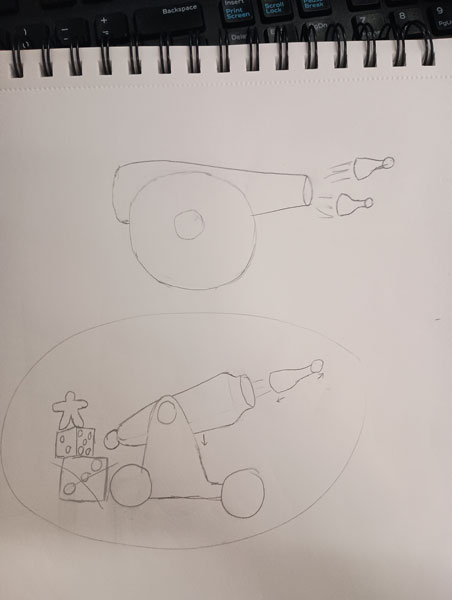
Process
I started off by looking into other board game companies and brainstorming unique ideas. The word "power" in the briefing stood out to me, so when I was first coming up with ideas I thought a lot about powerful imagery. I looked a lot at different board game pieces, but decided to go with the default "pawn" and "person" pieces because they're the most recognizable. I also noticed that most game company logos have mainly cool colors, but I wanted to stick to warm colors to stand out from the competition and compliment the yellow that the brief asked for. I decided to play off of the name Volley, which can refer to projectiles. I came up with the idea for a cannon that shoots out game pieces. Eventually I decided to have another piece manning the cannon, and have one of the wheels be a game token.
I didn't know exactly how to advertise to couples specifically, so I decided to lean into the playful and competitive side of board games. I believe that a lot of couples turn to board games that are fun to play together and compete against each other, and I think the cannon and the "pawn" piece represents this well. In advertising, the company could have another cannon facing this one with a different color to further show the competitive angle, but I felt that would be too complicated for a logo.
I ended up created a simplified version of the logo so that the client could have more versatility. I considered making other versions, like a grayscale design or a version with the brand name as text, but I decided that these wouldn't fit the brief because the client asked for a pictorial with color.