Color Infographic
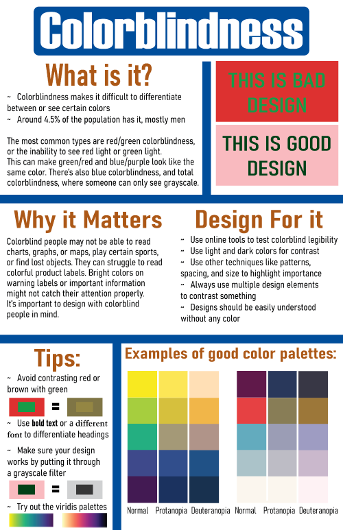
Version 1

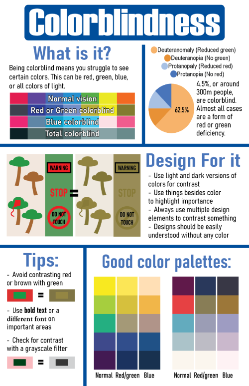
Version 2

I chose the topic colorblindness because I don't hear it spoken about very often, but I think it's very important to know about and understand as a graphic designer. I made sure that the main color palette of my poster was colorblind-friendly, and I tried to use common pairings (red and green, rainbow) in the examples I created. I learned a lot more about colorblindness during research for this project, and I got some practice condensing information and trying to communicate with visuals instead of text. I had to remove a lot of text and add a lot more imagery and color in my design, so it was easier to understand and more visual. I chose the layout that I used because it seemed like the best fit for the information I wanted to convey. I tried to use a lot of examples of how colorblind people see things and I wanted to emphasize the importance of contrast to get information across. I made sure to include examples of palettes that were and weren't colorblind-friendly. During critique, it was pointed out to me that the alignment was off and there was too much text, and that the text was too hard to read. It was also mentioned that there wasn't enough negative space. Someone didn't like the brown heading color. In my revisions I focused on making the text more concise, larger font, and easier to read, giving more negative space, fixing alignments, and making things more clear and legible.
© 2025 Rachel Weinrich